University Colors
PRIMARY COLORS
The primary University colors are gold, white, navy blue, and gray. To maintain visual consistency across mediums, the University’s CMYK and color pantones vary per color. The chart below details the proper color pantones and CMYK values (coated and uncoated) as well as HEX and RGB to be used by medium below, i.e. web, print.
The University mark features the three primary colors from the University Brand Guide: Gold (PMS 1235), Navy Blue (PMS 2767), and Grey (Cool Grey 6). The single color versions of the University mark may ONLY be in black or navy, or white for placement on navy backgrounds.
University Communications completed the process of finalizing the CMYK (cyan, magenta, yellow, and black) color builds for the new brand colors. In this process, the CMYK numbers have been finalized provide our schools, colleges, and departments with better color consistency across vendors, printing equipment, and paper styles. Therefore, there are different CMYK color builds for offset and digital printing, as well as for coated and uncoated paper. Offset printing means conventional printing with a printing press that uses plates. Digital printing means a printing press that does not use plates, and is generally used for projects that require fewer quantities.
PMS 2767 C – Coated
PMS 2767 U – Uncoated
RGB 15/32/68
HEX 0f2044

PMS 1235 C – Coated
PMS 122 U – Uncoated
RGB 255/183/27
HEX ffb71b

PMS CG 6 C – Cool Grey 6 Coated
PMS CG 6 U – Cool Grey 6 Uncoated
RGB 190/192/194
HEX bec0c2
SUPPORTING COLORS
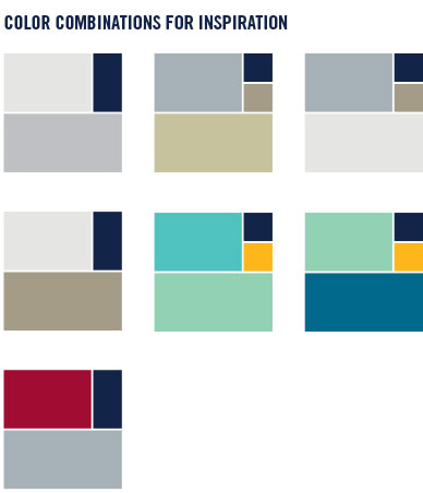
To provide flexibility while maintaining a consistent look across the marketing and communication materials, the University maintains a palette of complementary, bold, and neutral colors.
The University’s supporting colors are to be used as design accent color options only. Most work should heavily focus on and emphasize our primary colors, not our secondary ones.

PMS 7543
RGB 166/176/183
HEX a6b0b7
CMYK Coated 19/9/8/22
CMYK Uncoated 29/13/13/2

PMS Cool Gray 1
RGB 229/230/228
HEX e5e6e4
CMYK Coated 4/2/4/5
CMYK Uncoated 4/3/6/7

PMS 7536
RGB 165/156/135
HEX a59c87
CMYK Coated 11/13/30/32
CMYK Uncoated 31/28/38/2

PMS 453
RGB 197/194/155
HEX c5c29b
CMYK Coated 11/7/35/15
CMYK Uncoated 11/6/36/15

PMS 345
RGB 146/209/179
HEX 92d1b3
CMYK Coated 43/0/37/0
CMYK Uncoated 46/0/40/0

PMS 3258
RGB 79/194/191
HEX 4fc2bf
CMYK Coated 63/0/30/0
CMYK Uncoated 65/4/36/2

PMS 634
RGB 01/105/140
HEX 00698c
CMYK Coated 100/13/10/41
CMYK Uncoated 100/12/14/31

PMS 7427
RGB 160/12/48
HEX a00c30
CMYK Coated 8/100/70/33
CMYK Uncoated 7/87/61/20
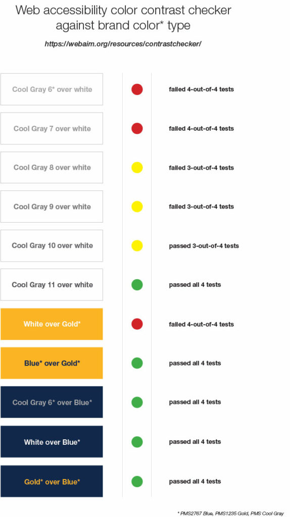
Readers may have difficulty when text, images, and the background color are too close together in the color spectrum. The measure of this variation is contrast ratio. A good example of this is that you would not want to put navy blue text on a black background because there is not enough contrast ratio to allow good separation between the text and the background. It is best practice to ensure that text and backgrounds have a contrast ratio of 4.5:1 and there are tools on the web to help determine the contrast ratio.
Combinations of the University colors have been tested with an accessibility color contrast checker to determine if the contrast ratio is high enough to maintain easy readability. The cool gray color is not dark enough to provide contrast on a white background. While we recommend using the gold in a very limited fashion you should note that white text on the gold background also fails most tests. Cool gray, gold, and white all provide acceptable contrast on the University blue.
We recommend testing color combinations for acceptable contrast ratio as you design. A good tool is at https://webaim.org/resources/contrastchecker/.