University & Unit Logos
UNC Greensboro’s visual identity is crucial to its branding and must be consistently applied across all communication materials. This includes accurate use of logos, wordmarks, typography, photography, videography, colors, and messaging. Adhering to these guidelines fortifies the University’s brand, aiding in the efficient realization of strategic objectives and institutional goals.
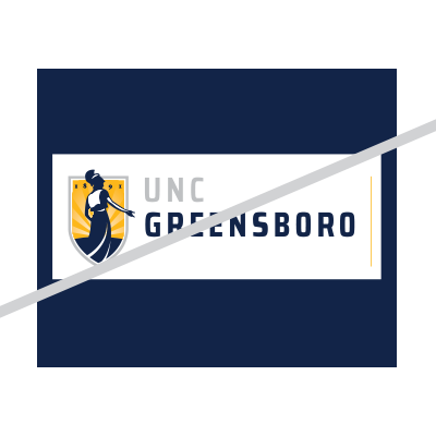
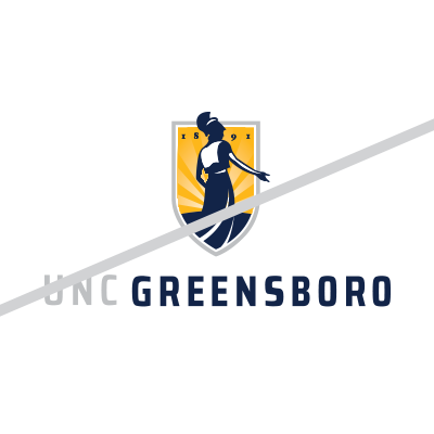
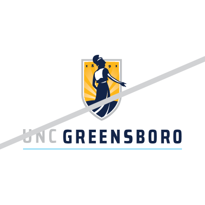
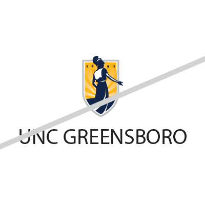
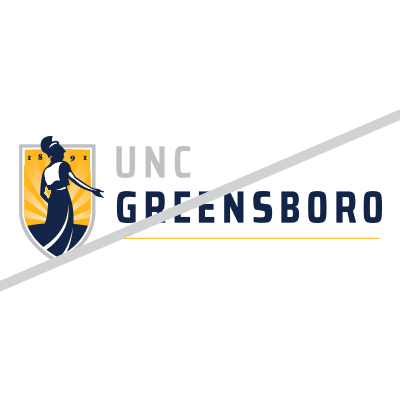
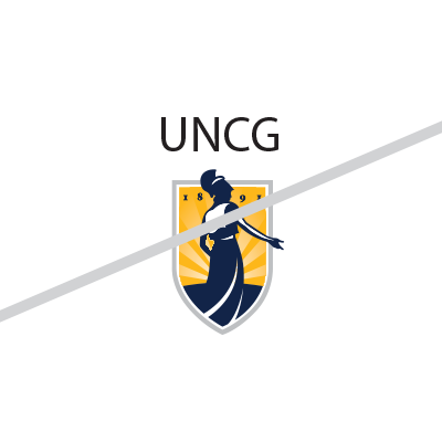
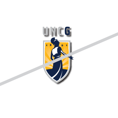
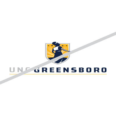
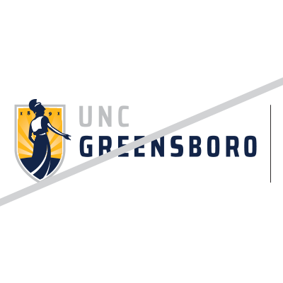
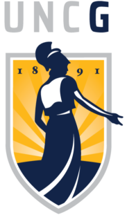
THE UNC GREENSBORO LOGO
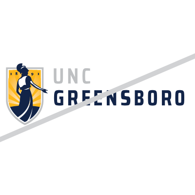
The official logo of UNC Greensboro features Minerva, the Goddess of wisdom, schools, art, and strategic warfare. Initially launched in 2004, the logo underwent a refresh in 2018, incorporating a gray outline that symbolizes both the connection to the university’s athletic and spirit mark, as well as the prominence of gray in the university’s primary color palette. Minerva’s outstretched hand now points directly to “Greensboro,” reinforcing the University’s connection to and impact on the emerging city of Greensboro.
The University offers four logo styles:
- Vertical
- Horizontal
- Wide-horizontal
- Emblem (or abbreviated)
Avoid using these logos together. The University logo family includes single-color versions of all four styles, as well as unit logos for the University’s colleges, schools, programs, etc.

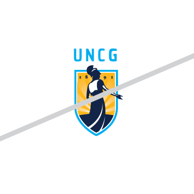
Utilize this logo in vertical spaces.

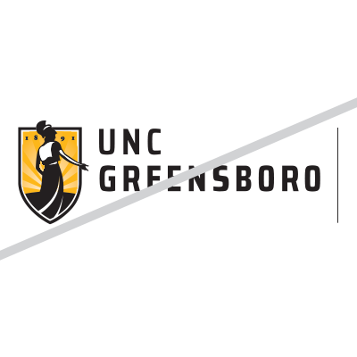
The preferred horizontal logo has Minerva’s outstretched hand pointing to “Greensboro” to communicate our welcoming campus.

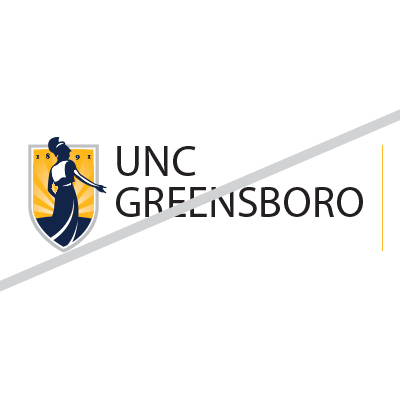
Use the horizontal wide format logo with the University tagline if space allows.
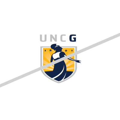
Use the emblem logo, also known as the “abbreviated logo,” for when space limits prevent use of the full-sized University logo options
UNCG’s unique, flexible, and engaging tagline is: Find your way here.
The University’s tagline is an invitation— for the next class of Spartans, new faculty, and staff members to join the University. It is also a prideful statement—at UNC Greensboro you will find what you are seeking and you will make a difference.
The flexible tagline enables University units to express their uniqueness and connect with their targeted audiences by exchanging the word “way” for relative terms.
HOW TO USE THE TAGLINE
The tagline should be proper case and punctuated with a period except when used in headlines or stand alone graphic usage. While there are many words that can be used to complete the “Find your ____ here,” the primary institutional logo and all University-level branding efforts will conclude with “Find your way here.” This concluding statement may come in the form of the University logo featuring the tagline:
Important tagline rules
- The Minerva logo lock up with the tagline may not be changed. The Minerva logo lock-up with the tagline shall always be “Find your way here.”
- Do consider using a series of flexible taglines within a single advertisement, promotion or marketing communication.
- Do not shorten or lengthen the tagline. Only “way” may be exchanged for a singular word.
- Do not replace “way” with “you,” “yourself,” or “self.”
- Do not exchange “way” for “path,” “wisdom,” or “future.”
- Do not replace “way” with locations or labeling of services, such as “lunch” or “registration.”
- Even if you use the tagline or a flexible version of the tagline in your copy or headline, use the Minerva logo lock up with the tagline “Find your way here” in the design.
- Do not use past University taglines.
Special Note: The thin rule line in the logo is crucial and cannot be removed or the color changed from the official version(s) available in the Brand Guide. This has been an issue with some specialty advertising vendors who have not noticed the line. You may find times where the line needs to be slightly thicker to have enough visual weight. We can help if you run into this situation and this variation is allowed.
Brand Guide
Creating flyers, digital invitations and event signage at UNCG just got easier! In the past, campus communicators and graphic designers needed to submit a request to download unit logos, colors and fonts to create promotional materials. But now there’s a one-stop shop for all your graphics needs in Canto.
We already use Canto to download photos, but now all graphic assets can be found there including the following:
- Logos: Find official University marks as well as departmental or unit logos.
- Colors: Blue and gold and beyond. Be sure to check out our secondary colors.
- Fonts: Stay on brand with headlines and descriptive text.
- Digital templates: From Power Point presentations to social wallpapers.
UNIVERSITY UNIT LOGOS
The University unit logos are tailored to each of the University’s colleges, schools, programs, etc. Unit logos are not for use on letterhead or university web pages. These communications are standardized and use the full name of the university logo.
Download a University Unit Logo
The University logos include unit marks with the names of the college, schools, centers, programs, and departments. Unit logos are not for use on letterhead or university web pages. These communications are standardized and use the full name University logo.
Many units will be able to meet their communications needs by using the abbreviated or full name university logos. However, if your unit has a specific need for a unit logo, please contact brandaid@uncg.edu. To ensure consistency, units are prohibited from creating their own University logos. All unit logos are now found as part of the Brand Guide and are listed alphabetically.
Graphic Identifiers for Special Events
A logo may be used to mark special occasions such as annual events, University-wide initiatives, and anniversaries. The duration of the use of this logo is short-term, and promotes and identifies with only this particular event. These logos must be approved in advance by University Communications, contact brandaid@uncg.edu. A secondary logo cannot include any existing UNC Greensboro mark.
UNACCEPTABLE USES AND SAFETY AREAS
UNC Greensboro logos should stand apart from their surroundings. For consistency, maintain a clear area roughly equal to the height of the UNCG in the abbreviated name logos, and the height of the text in full name logos. Never print graphics, rules, typography, or other elements in this area. Appropriate clear space around the logos provide safety areas that set them off from adjacent text or images.
Modifications
The University logos may not be altered, modified, disassembled, reproportioned, or repositioned. The shield with Minerva must never be separated from the University name, full or abbreviated. The “G” associated with the instructional marks shall be either navy or white.
The following examples illustrate incorrect uses of the logo. Although numerous incorrect uses might be possible, these are intended to show common examples of improper use. To receive additional guidance about proper logo use, contact University Communications at brandaid@uncg.edu.