Maintaining a current website is key to increasing user satisfaction, ensuring a good user experience, and enhancing the confidence in the content instilled in the reader. The UNCG Web and Mobile Operating Committee adopted a website audit procedure and checklist as well as a content lifecycle procedure for University websites to follow.
UNC Greensboro offers employees asynchronous website content training. The training covers best practices for search engine optimization (SEO), accessibility, and more. To request access to the training, email nextgenweb@uncg.edu. Additional quick reference tips for website maintenance are below.
Ideally the content on a site should be updated at least once a week. While it may not be possible to create new articles or images every week, there are ways to achieve this goal outlined below. If these techniques cannot be used, then it is important to review content at least monthly to ensure that: all links are still working; content doesn’t appear to be out-of-date; and date specific events are clearly understandable to the reader.
Creating a website for an annual special event has unique opportunities. An annual event website requires special attention after the event to ensure the reader knows that the event has already occurred. If the event truly recurs annually, then proper maintenance of the site can help increase attendance for the future events.
Prior to the event:
Be sure that you’re building the site with content that clearly shows that the event is in the future. Add the year into the copy so that the reader is sure that they aren’t reading a stale site. For example you might say, “The 2025 Science Everywhere” instead of “This year’s Science Everywhere.”
If you are using images from previous years, it may look dated because of the season, or some other identifying element. Therefore, be sure to identify the timing of the image in the caption, i.e. “Transforming liquid into gas was a show stopper at the 2019 Science Everywhere festival.”
After the event:
This is when the real work pays off. Go through the site and remove anything that was projecting forward in time for the event. Even the tense in verbs can cause the reader to wonder if the event has already occurred or is upcoming.
Take out content that is specific to the past event.
Update the introduction and invite the reader to the next year’s event. Give a date of the event if possible even if it is tentative (and say so).
Thank sponsors but be clear which year’s event they sponsored (also a great time to start reaching out to new sponsors for the upcoming event.)
Update contact information.
Remove any links to outside sites that may no longer apply or that you suspect may become broken.
If you want to show a recap of the event via video or an article be clear that you’re speaking of a past event. Recap the event within one month following the date of the event, unless there is a unique news angle or novelty related to the timing of the recap.
Year-round websites for ongoing events don’t require the concerted post-event clean up that an annual event requires. But year-round sites can make taking the time to review the site harder to schedule.
Look for ways to add new content near the top of the page near the “front” of the site as easily as possible.
Tips for this include:
Republishing content you’re already creating for another distribution method.
Put in a newsfeed from an outside source, or another one of your sites, to automatically post content.
Add images showing events or changes in the office if you don’t have time to write articles.
Publish a feed from your social media channels.
Whether you do this or not you should review your site once a month to ensure it isn’t looking stale to the reader.
Key things to look for here are:
Images that “look” out of season. Don’t show winter scenes on your homepage when it is July. Outdated images communicate to the reader that you haven’t updated the images, and often makes them wonder if the content is no longer accurate too.
Watch for events that don’t show the year. An article that gives the date of an event as March 15th is confusing when someone is reading the site in October. They wonder if this is a story about the upcoming event or last year’s event.
Links that are broken because content has moved.
Key personnel that are referenced but are no longer on staff. These can be edited to say “former director” or you can use the opportunity to get a new quote from an existing staff member.
Test forms to ensure that they are still working and the recipients are handling them properly.
Key responsibilities have not changed. If your department is no longer monitoring the parking lot then update that story to help the reader know who is now responsible.
Redirect any pages that you have to remove or change their URL. Many times other sites will build what is called a Backlink into your site if they find content that they feel their readers would be interested in. If you remove a page with one of these Backlinks then when their reader tries to visit your site they get a “page not found” error. It would be a better user experience if they were automatically redirected to a similar page or to your homepage so that they could find more content from you. You do this through a 301 redirect.
Style changes that haven’t been kept up. Has the organization changed brand style and your site no longer looks like the rest of the University? Have trends changed and the way your site is styled looks dated and gives the impression to the reader that no one is working on the site? Has technology changed and you’re still using tools and techniques that don’t reflect the current capabilities?
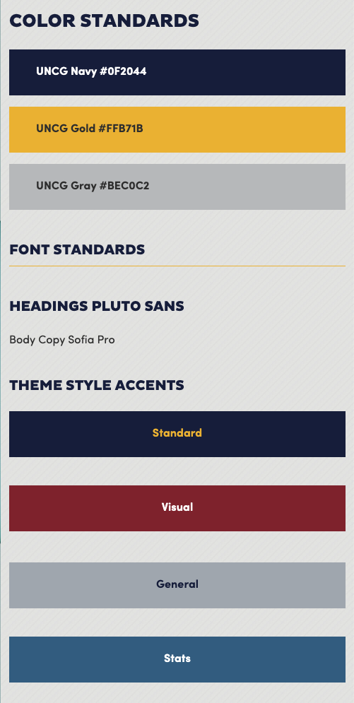
WEB COLORS
The UNCG Next Generation Website Project includes brand and supporting colors as defined in the brand guide’s colors page and web assets site. The project has designated certain microsite theme styles for consistent use specific support colors by web pattern. Theme style accents are not to be mixed (i.e. no lighter blue and maroon red on the same site) and must follow the design patterns.
WEB LOGO USAGE
The primary UNCG logo is included in the top left corner of the web page header that is part of the University theme. As a best practice and in accordance with the Next Generation Web Project’s microsite designs, units are to write out their full name in the subhead bar provided in each microsite home theme. We recommend units not repeat the unit logo in the body/content of your website.
A favicon (or favorite icon) is a small icon or graphic that is placed in most browsers near the title of the web page at the top of the screen. Because of the small size of this graphic, usually less than 16 pixels,UNCG has adopted the Unviersity G as the favicon. Use of the UNCG favicon is strongly encouraged. If it is not used, no other favicon is allowed.
Many browsers will use this icon as a customization for the your address when users visit your pages. Also when users bookmark a page within your site, this icon will often be associated with the bookmark.
The UNCG favicon is built into the NGWP WordPress theme and no action is necessary to include it in a site using the theme.
WEB TEXT & FONTS
University websites are to use brand fonts. Headings are in all caps using Pluto Sans Bold. Body copy is to be Sofia Pro Regular. The style sheets with the NGWP theme applies these standards appropriately if you don’t adjust the font or size of text.
Navigation on websites and other electronic communications should be styled in all upper case Sofia Pro with Arial as a substitute. (font-family: Sofia Pro, Arial, sans-serif;)
Sidebar headings and sub-headings should utilize Sofia Pro. All other text and/or navigation elements in a sidebar should be displayed in the Sofia Pro in appropriate case, with Arial as a secondary option: (font-family: Sofia Pro, Arial, sans-serif;)
Body copy on websites and other electronic communications should be styled in the san-serif font Sofia Pro with Arial as a substitute option. In most instances, body copy should be set as flush left. Font size for the content part of a web page is set at .75em in the UNCG global styles which will make content copy sized at 75 percent of the visitor’s default browser font size. The content copy line spacing (or line-height in CSS terminology) should be 1.7.
font-family: Sofia Pro, Arial, sans-serif;
font-size: .75em;
line-height: 1.7
In most cases, when web developers use the UNCG web assets including the global style sheet, body font styling should default to the above CSS. In situations where it is not possible to directly use the UNCG web assets, developers should approximate this font styling as closely as possible.
Readers may have difficulty when text, images, and the background color are too close together in the color spectrum. The measure of this variation is contrast ratio. A good example of this is that you would not want to put navy blue text on a black background because there is not enough contrast ratio to allow good separation between the text and the background. It is best practice to ensure that text and backgrounds have a contrast ratio of 4.5:1 and there are tools on the web to help determine the contrast ratio.
Accessibility tests can be performed using tools such as webaim.org/wave.
Abbreviations on web pages can help convey a message quickly and efficiently.
However, they can also be confusing, especially for first-time visitors who may not be familiar with your program. Additionally, abbreviations can cause confusion for visitors who have different accessibility needs and may be using adaptive technology.
In consultation with Accessibility Resources at UNCG, the following guidelines should be followed to ensure online content is available to all users:
Organizations, departments, programs, etc. should be spelled out on first reference. For example, the College of Arts and Sciences should be spelled out on first reference, and then CAS can be used on subsequent references if necessary.
Avoid less common techniques such as adding periods between letters or spelling phonetically, as these are not the generally accepted style and will probably be more confusing than helpful.
Keep your audience in mind. If there is a chance for confusion, take the time to provide clarification within the sentence or paragraph. Make sure to consider adaptive technology and test with screen readers and braille readers if possible.
The copyright in the footer of the webpage should be kept current to reflect the current year. This helps the reader know that the page has been updated and kept current.
PRESENTATION TEMPLATES
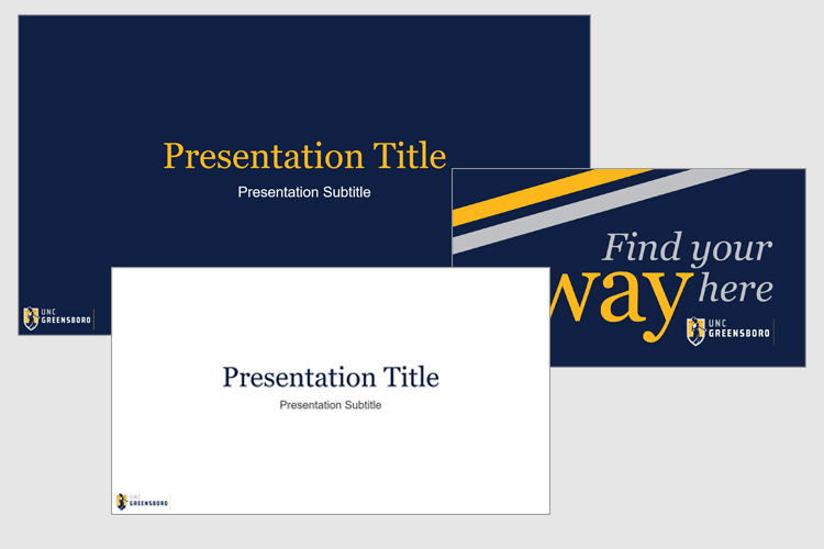
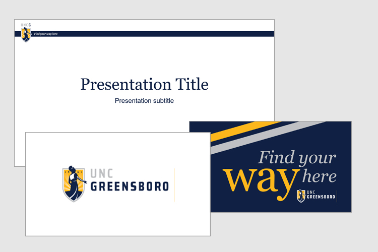
Students, faculty, and staff often use slide presentations on and off campus. Every speaking engagement is an opportunity to incorporate the University’s brand and your affiliation with UNC Greensboro. To maintain a consistent look for audiences, UNC Greensboro branded templates for PowerPoint and Google Slides are available for presentation needs. Widescreen (16:9 aspect ratio) and standard screen (4:3 aspect ratio) formats of the presentation templates are provided. When a projection image is needed, a logo-only cover slide can be used from the slide layout options of the chosen template.
POWERPOINT
Using the PowerPoint templates:
1. Determine whether you want to present in 16:9 (widescreen) or 4:3 (standard) format.
2. Download and save the appropriate template Zip file (widescreen or standard) of the chosen template.
3. Unzip the downloaded Zip file and open the downloaded template file in PowerPoint.
4. Save as a PowerPoint presentation (*.pptx), and then add your slides and content for your presentation.
With this option the logo is in the bottom left. Slide layout choices include either a navy or white background, cover slides, and additional slides for a “Thank You” slide and a tagline slide.
With this option the logo is in the top left over a narrow navy bar at the top and a white background. Slide layout choices include cover slides, and additional slides for a “Thank You” slide and a tagline slide.
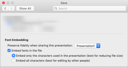
With PowerPoint you have the option to use UNCG brand fonts and embed them into your presentation so that it will look the same on other computers, even if they don’t have the fonts on their machines. Here are the directions to embed fonts:
Embed fonts in Word or PowerPoint
Click the File tab and then click Options (it’s near the bottom left corner of the window).
In the left column, select the Save tab.
At the bottom, under Preserve fidelity when sharing this presentation, select the Embed fonts in the file check box. You will see two checkboxes – such as Embed only the characters used in the presentation, and Do not embed common system fonts.
Click OK.
Embed fonts in a document or presentation
This feature is only available to Microsoft 365 Subscribers and in PowerPoint 2019 for Mac, version 16.17 or later.
Open the file you want to embed fonts in.
On the application (PowerPoint or Word) menu, select Preferences.
In the dialog box, under Output and Sharing, select Save.
Under Font Embedding, select Embed fonts in the file.When you save the file, the fonts used in it will be embedded in the file.


 When you save the file, the fonts used in it will be embedded in the file.